Reel
Work
About
Contact
Reel
Work
About
Contact
Kody Helart
Twitter - Supplier Diversity
An explainer for Twitter (shortly before that name was retired - RIP). Their brand guidelines were a lot of fun to work with, halftones, grungy textures, bright colors, and a handmade, stop-motion look? All for a good cause? Sign me up.
You may also like
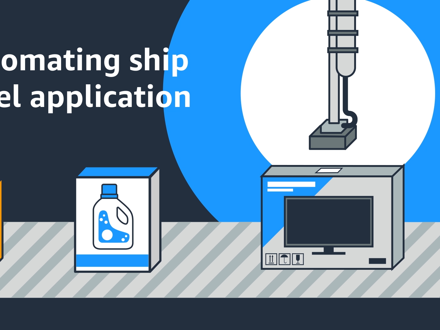
Amazon - Robotics
2022
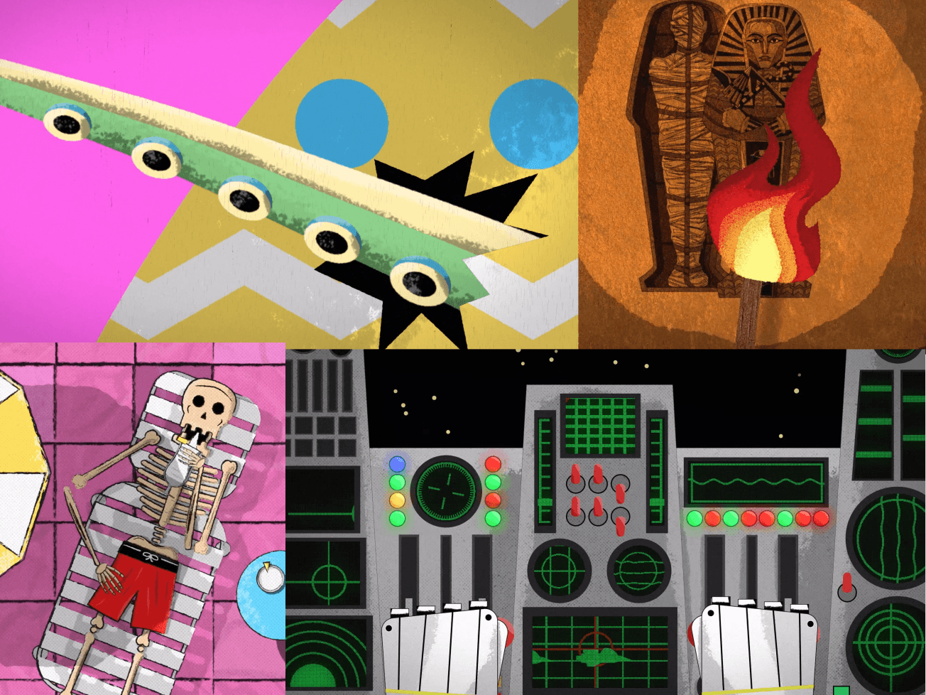
SYFY Idents
2024
AWS - Fraud Detector
2022
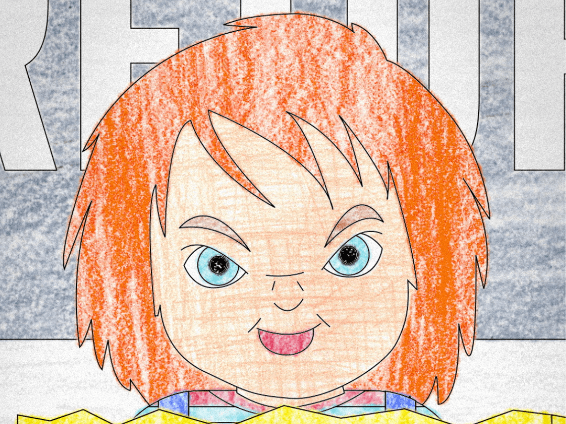
Chucky Escapes
2024
Lumen Technologies
2024
Starbucks - Earthquake Preparedness
2022
↑
Back to Top